If you’d like to inject some color into your survey’s questions and answers, or want to bring your quizzes to life, consider adding media — photos, audio, videos — to your projects. Crowdsignal will automatically adjust the media to fit comfortably on the page and to create a clear visual hierarchy throughout.
How It Works
Crowdsignal keeps all visual media – like images and video – contained so that your surveys look their best. That means keeping images and video at a certain ratio and using your browser’s native capabilities to display an audio player with built-in controls.
We won’t modify the image files you’ve uploaded in any way — we’ll only adjust the way your images display within the layout of the survey or quiz you’ve created.
Question Media
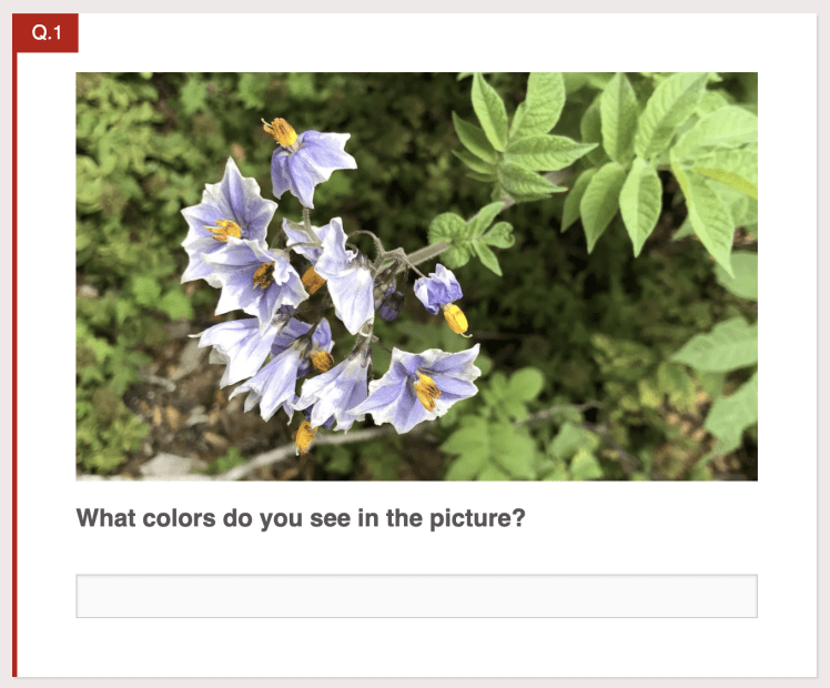
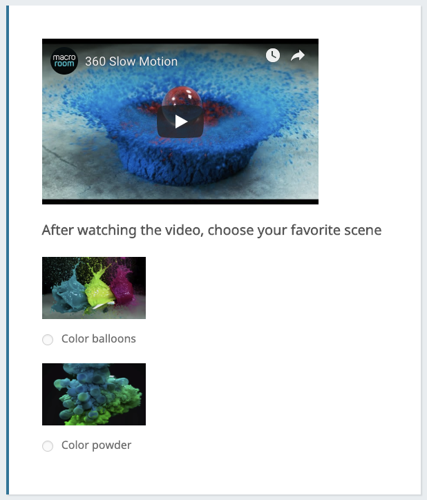
The media you choose for the top of a Question block is your Question media. All blocks support this media placement (with the exception of the HTML Snippet block). Images on Question media behave as a cover image, going from margin to margin of the question container while maintaining an aspect ratio of 10:6. The image is proportionally scaled to fit the width and vertically centered. Any exceeding height will be hidden by the container. On desktop devices, adding an image with a resolution of 772×440 (or equivalent proportions) should make the image completely visible without being cropped.
Answer Media
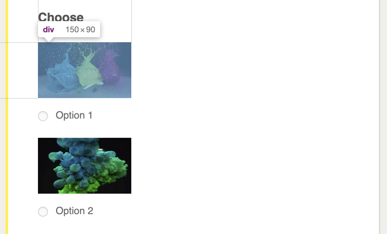
Answer media is any media you add to answers on multiple-choice or ranking questions.
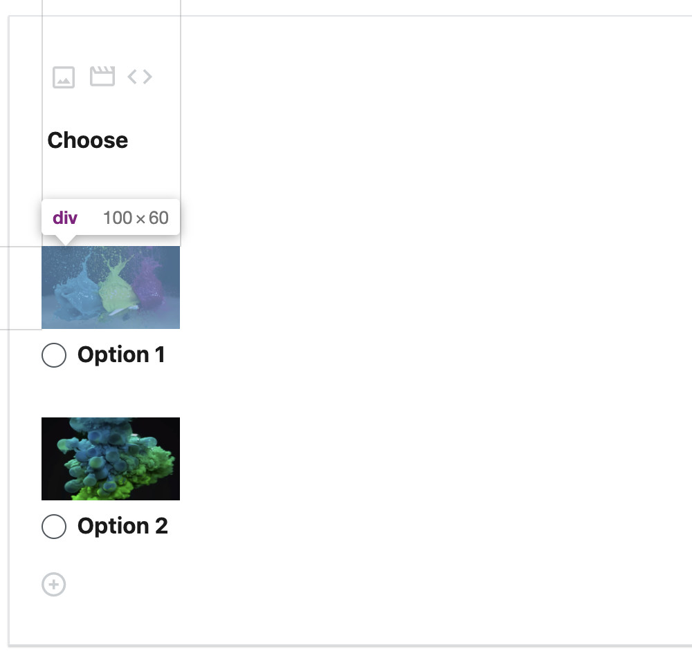
To make things clear and preserve a visual hierarchy, Answer media are smaller than Question media — their dimensions are 150 pixels by 90 pixels to the viewers and 100 pixels by 60 pixels in the editor.
Here’s How These Media Look Together…
Custom Styling
The dimensions we show above are the default ones we recommend, but if you’d like to customize them further, you can. Our Business and Team plans come with the option to create and edit your own custom style with CSS (Cascading Style Sheets).
CSS Classes
If you’re comfortable tinkering with CSS, here are the classes you’ll have to address to customize the look of your Crowdsignal projects.
To control the fit and alignment of Question Media:
.qMedia: this is the container that controls media alignment..qMedia div: this internal container keeps your media’s size and fit correct..qMedia div img: this image-specific style will center the image and hide the rest..qMedia audio, .qMedia span: these containers handle audio and video embeds.
.qMedia {
  display: inline-block;
  max-width: 400px;
  max-height: 240px;
  overflow: hidden;
  margin-bottom: 16px;
}

.qMedia::after {
  content: '';
  display: block;
  clear: both;
}

.qMedia audio, .qMedia span {
  vertical-align: top;
  max-width: 400px;
}

.qMedia iframe {
  max-width: 400px;
  max-height: 240px;
  pointer-events: none;
}

.qMedia div {
  background-size: cover;
  display: inline-block;
  width: 400px;
  height: 240px;
  position: relative;
  overflow: hidden;
}

.qMedia div img {
  position: absolute;
  max-width: unset;
  vertical-align: top;
}
Answer Media uses different CSS classes to achieve the same results. Here they are:
.question-block__answer-media-public: this is the container that controls media alignment..question-block__answer-media-public div: this internal container keeps your media’s size and fit correct..question-block__answer-media-public div img: this image-specific style will center the image and hide the rest..question-block__answer-media-public audio, .question-block__answer-media-public span: these containers handle audio and video embeds.
While you can use the classes above to style all Answer media, make sure you use prefixing for the question type being styled:
.PDF_QT400for Multiple Choice blocks..PDF_QT1300for Ranking blocks.
.question-block__answer-media-public {
  max-width: 150px;
  max-height: 90px;
  overflow: hidden;
  display: block;
}

.question-block__answer-media-public::after {
  content: '';
  display: block;
  clear: both;
}

.question-block__answer-media-public audio,
.question-block__answer-media-public span {
  vertical-align: top;
  max-width: 150px;
}

.question-block__answer-media-public iframe {
  max-width: 150px;
  max-height: 90px;
  pointer-events: none;
}

.question-block__answer-media-public div {
  background-size: cover;
  display: inline-block;
  width: 150px;
  height: 90px;
  position: relative;
  overflow: hidden;
}

.question-block__answer-media-public div img {
  position: absolute;
  max-width: unset;
  vertical-align: top;
}
Examples
What kinds of custom styles are possible? Here are a few ideas.
Say you want to maximize Answer media width. Keep in mind that some styles require the !important suffix to function.
.question-block__answer-media-public {
	max-width:unset!important;
	max-height:unset!important;
	overflow:hidden;
	display:block;
}

.question-block__answer-media-public::after {
	content:'';
	display:block;
	clear:both;
}

.question-block__answer-media-public div {
	width:auto!important;
	height:auto!important;
}

.question-block__answer-media-public div img {
	max-width:100%;
	top: 0;
	left: 0;
	position:relative!important;
	height:auto!important;
}
What if you’d like to center your Question media and show it in half-width? You can do that too.
.qMedia .qMedia__image-container {
	width:50%!important;
	display:block;
	margin:0 auto;
}
Or… what if you want to set your images free and show them with no fixed styles? To do that, just remove all the styles you see above.
Or reset the restrictions with this override (for example, in Multiple Choice blocks):
.PDF_QT400 .question-block__answer-media-public {
    max-width: unset;
    max-height: unset;
}

.PDF_QT400 .question-block__answer-media-public div {
    width: auto;
    height: auto;
}

.PDF_QT400 .question-block__answer-media-public div img {
    max-width: 100%;
    height: auto!important;
    position: relative!important;
    top: initial!important;
    left: initial!important;
}
Keep in mind that your images might exceed the layout, resulting in a survey or quiz that looks less polished.
Other Media
You can control audio and video with the same styles — just change img to audio or span (you’ll usually find embeds in a span tag). You can even make tweaks in the iframe tag styling until you get the layout you’re looking for.
Recommended Header Image Dimensions
The aspect ratio of the image container on survey and quiz pages changes depending on the width of the screen a survey or quiz is being viewed on, so the optimal size for an image may differ. On desktop devices we recommend using images that have a resolution of 772×440 or a 1:75 aspect ratio.
 Crowdsignal